Today in small downtime from paperwork I decided to do a quick research on the relationship between price and days on the market.
I came across something called the Real Estate Pricing Pyramid.

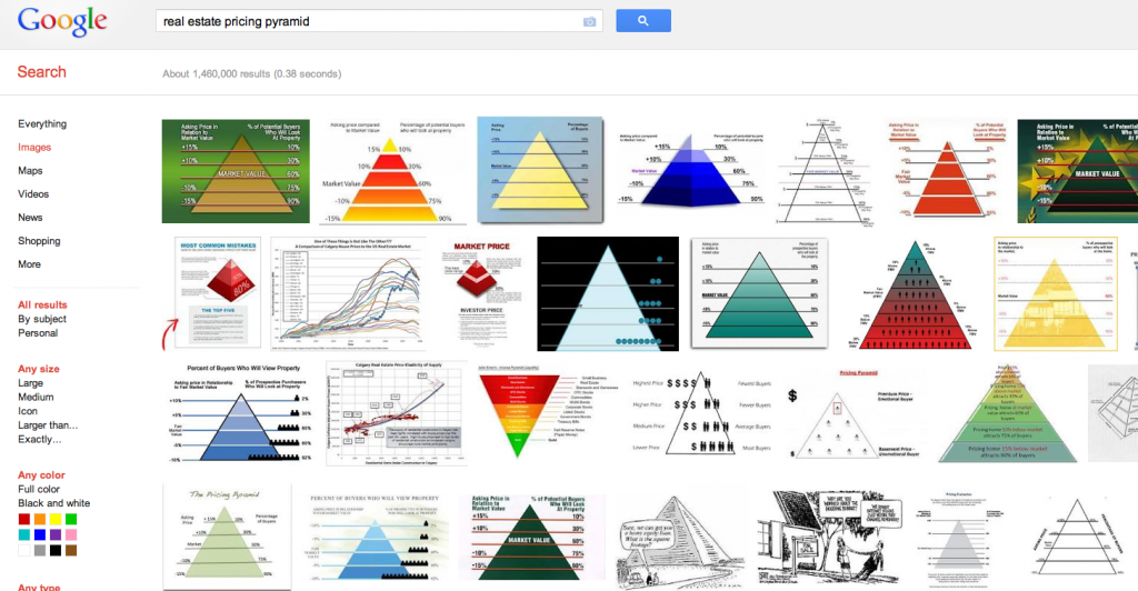
As you can see from the Google image results above the pricing pyramid is a popular fellow! However the source, publisher, methodology and in fact any real back story is very difficult to find.
What Is The Real Estate Pricing Pyramid?
In simplest terms it is an infographic that shows the correlation between the price of a home listed for sale relative to market value and the number of showings to prospective buyers.
The most common numbers I have seen quoted are as follows.
| House Price Relative to Market | Percentage of Buyers who will tour the home |
| +15% | 10% |
| +10% | 30% |
| Fair Market | 60% |
| -10% | 70% |
| -15% | 90% |
That with some photoshop becomes a neat little pyramid. But as I said none of the pyramid’s I can find actually show the source of data. A cynic can easily argue it’s no more than a sales tool to scare homeowners into under pricing their home.
Because there is no data to support the pyramid I won’t be using it in my marketing or with potential homes sellers. But I will be keeping my eye out for more data that either supports or disproves it.


