If you live in Phoenix. You know one thing for sure, it’s a big place. Pretty spread out geographically.
Phoenix Metro area is 16,573 square miles. Contrast that to New York Metropolitan area is 11,842 square miles and has a a population of 22,085,649. Manhattan has a population density of 69,771 people per square mile!
In real estate terms this large area means big differences in price across locations. It also means that using statistics for the entire metro area may not reflect accurately what’s going on in a smaller pocket.
All that said referencing the overall market can be useful as a starting point.
One of the most notable real estate market indexes is the Case Shiller published by Standard & Poors.
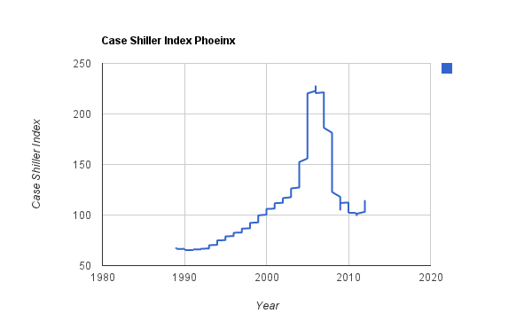
I took the data they publish and made the chart below. It runs from January 1989 to June 2012.

Sometimes it’s easy to forget just how dramatic the market has been in the last 7 or 8 years.
According to the numbers May 2006 the index peaked at 228.07. Crashing down to a low of 99.12 in September 2011. The last time the index was below 100 was in December 1999.
When determining your buying and selling decisions you definitely need to think far more locally than this but it’s sometimes useful to just visualize where you bought on the timeline and what that might mean for your home.


