I love being part of the wider Sotheby’s International Realty group. The quality of the signs and print materials we have access to is unmatched anywhere in my market of Scottsdale and Paradise Valley.
The Sotheby’s watermarked letterhead paper is very neat.
The change to the web presence for Sotheby’s International Realty seems to only really affect the front end of the site. My Sotheby’s International Realty Agent page is seem unchanged.
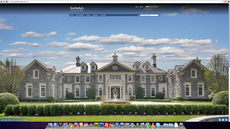
The redesign is very image focused with big splash screens of the amazing properties listed by Sotheby’s currently. The design uses HTML5 type coding, all the image effects are created with javascript as opposed to Adobe Flash. For this reason the site looks identical on my iPad and iPhone.
I like the new look. If I had a couple of small criticisms they would be that some of the photograph’s used are not of high enough resolution to look good on my 27inch iMac. The only other criticism would be that the iPhone version is hard to use and I think they should put a mobile version in place specifically for phones, this design works fine on tablets like the iPad.

What do you think of this design www.sothebysrealty.com?


